Overview
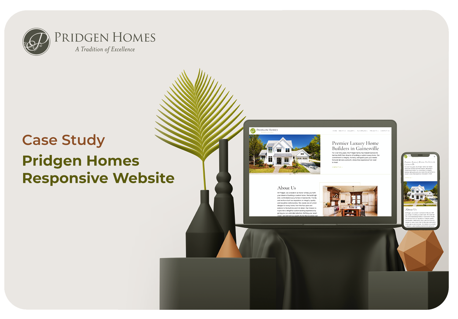
Pridgen Homes are the premier luxury home builders in Gainesville. For over forty years, the Pridgen family has helped Gainesville families fulfill their dreams of building a custom luxury home.
Project Info
Freelance – In collaboration with Liquid Creative Studio, FL, USA
Roles
UX Designer | Visual Design
Responsibilities
Wireframing, low and high-fidelity prototyping, conducting usability studies, accounting for accessibility, and iterating on designs.
Tools
Xd, Illustrator – Final Website developed with WordPress
Problem Statement
Users lack the ability to navigate easily and find the necessary information with the scattered layout, cluttered designs, and complex categories.
The Goal
To design a simplified and an enhanced user flow, quick access to all the features and more user-friendly access to all the content and let the user be able to reach out through the website.
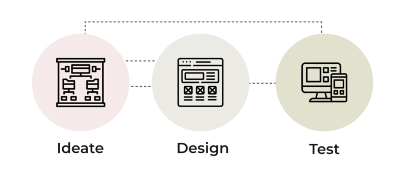
My Design Process
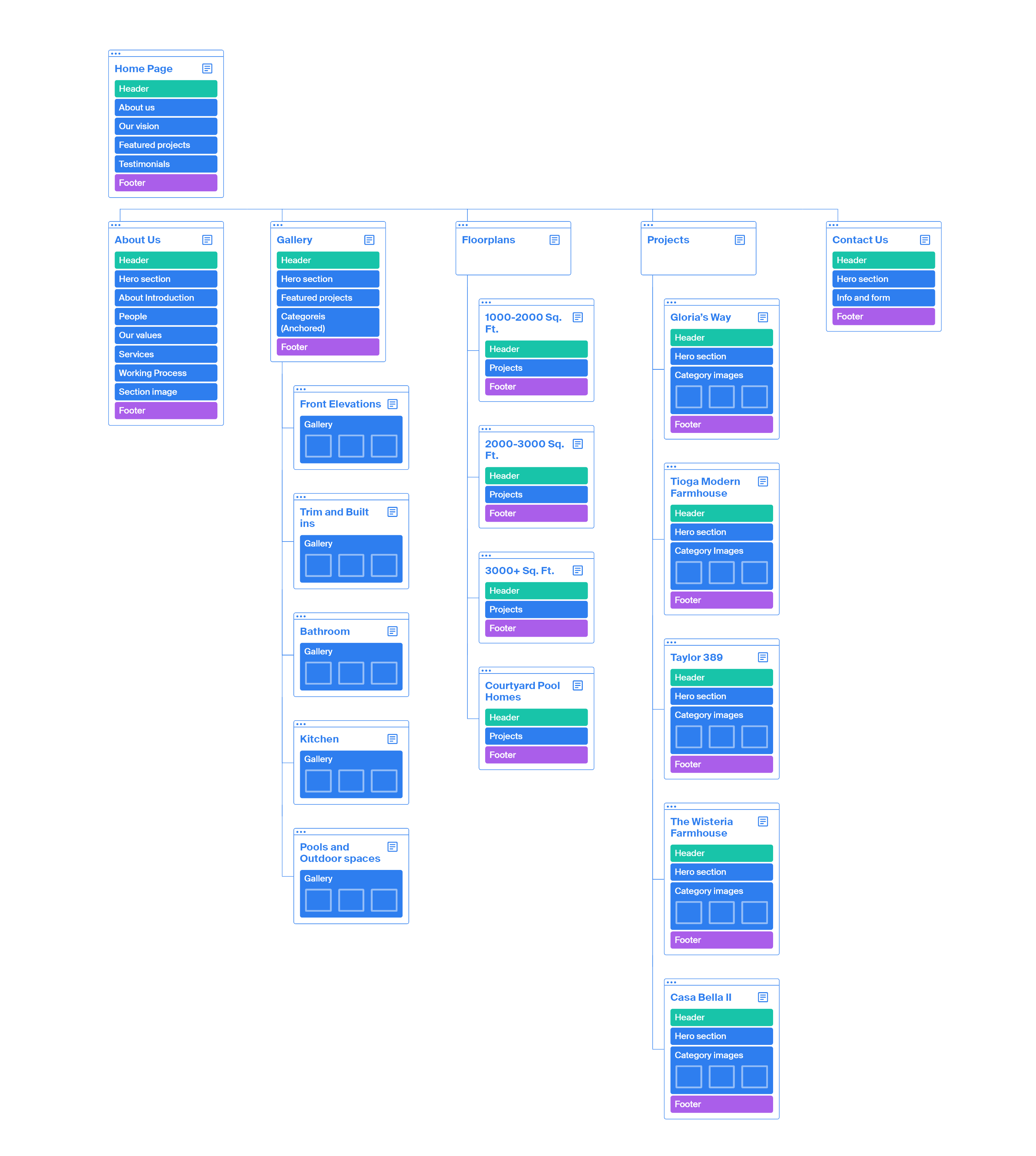
Sitemap
Difficulty with website navigation was the primary pain point for users, so I used that knowledge to create a sitemap. My goal here was to achieve a strategic information architecture that improve the overall website navigation thus resulting in an enhanced and user-friendly journey.
I ensured that the elements that made it to digital wireframes would be well-suited to address user pain points where easy navigation was a key user need to address in the designs.
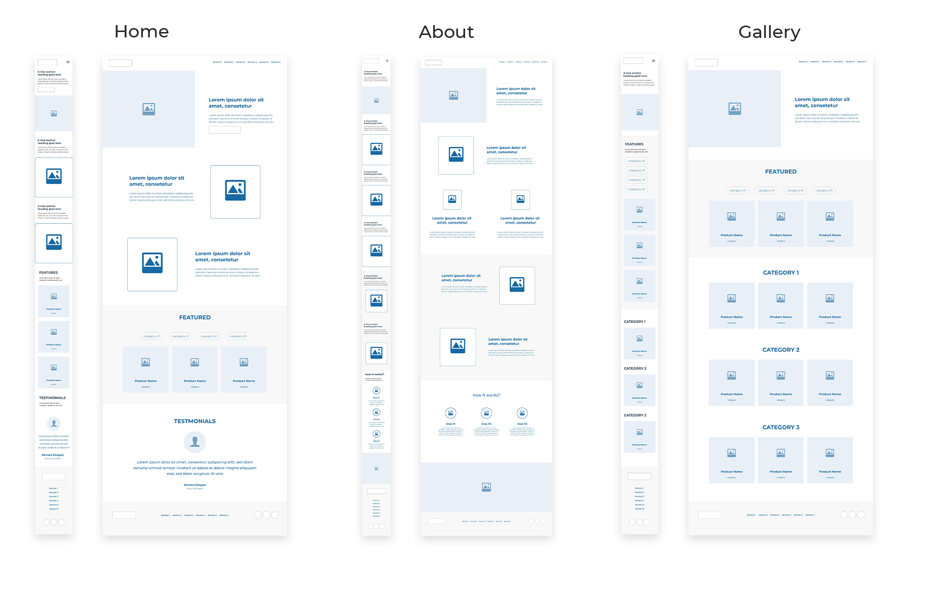
Low-fidelity prototype
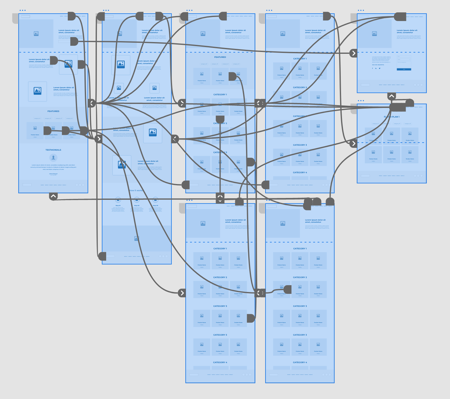
Using the completed set of digital wireframes, I created a low-fidelity prototype. The primary user flow I connected was from home page to contact page, so the prototype could be used in a usability study.
Usability study: Findings
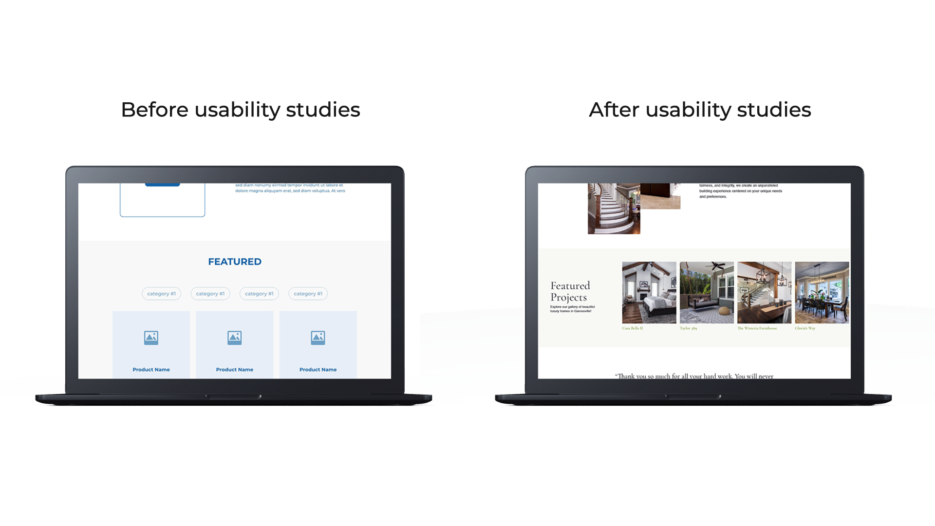
I conducted two rounds of usability studies. Findings from the first study helped guide the designs from wireframes to mockups. The second study used a high-fidelity prototype and revealed what aspects of the mockups needed refining.
Round 1 Findings
- Users wanted to see more projects on home page
- Users would like the copy to be minimal
- Users would like the primary navigation and contact info at the end of each page
Round 2 Findings
- There was no clear display of projects category wise
- Users found opening a new tab at each sub menu was tedious
Interface Design
Mokcups
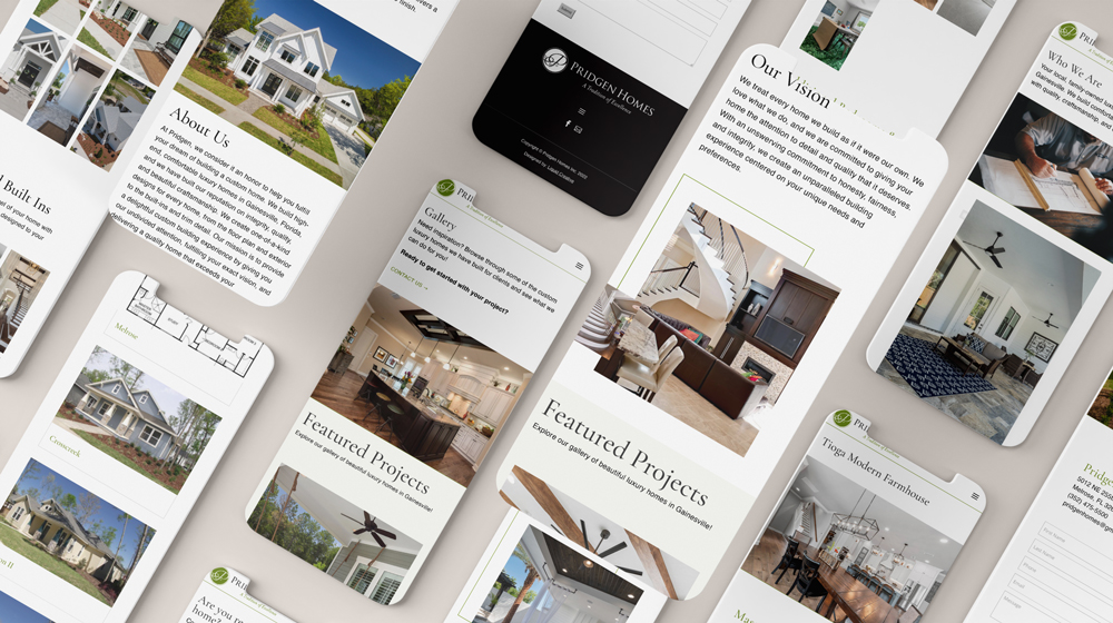
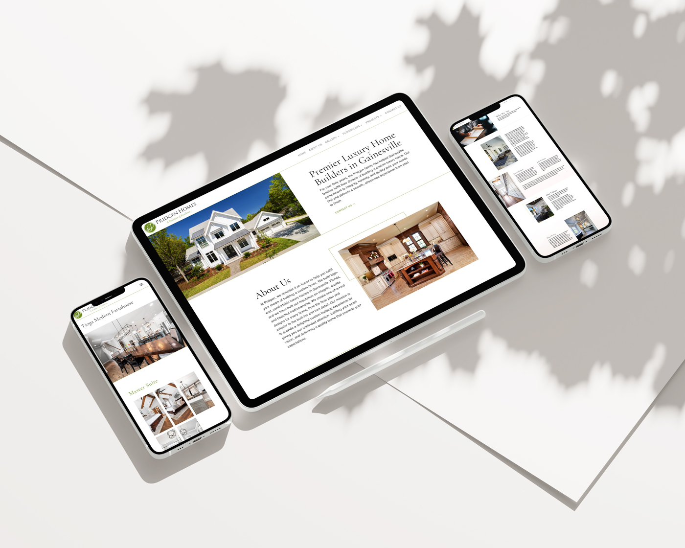
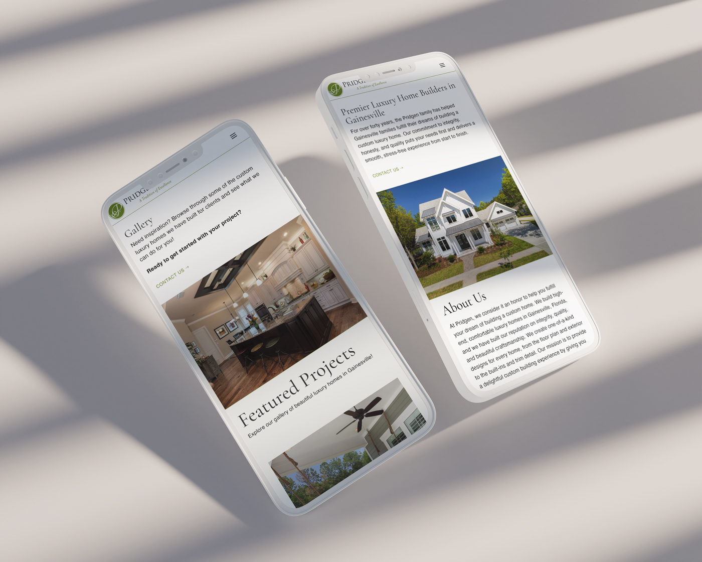
The first usability study revealed the frustration with the limited display onto the home page. In order to streamline this flow, I incorporated the “Featured projects” in such a way that the user gets to see more options without any limitations.
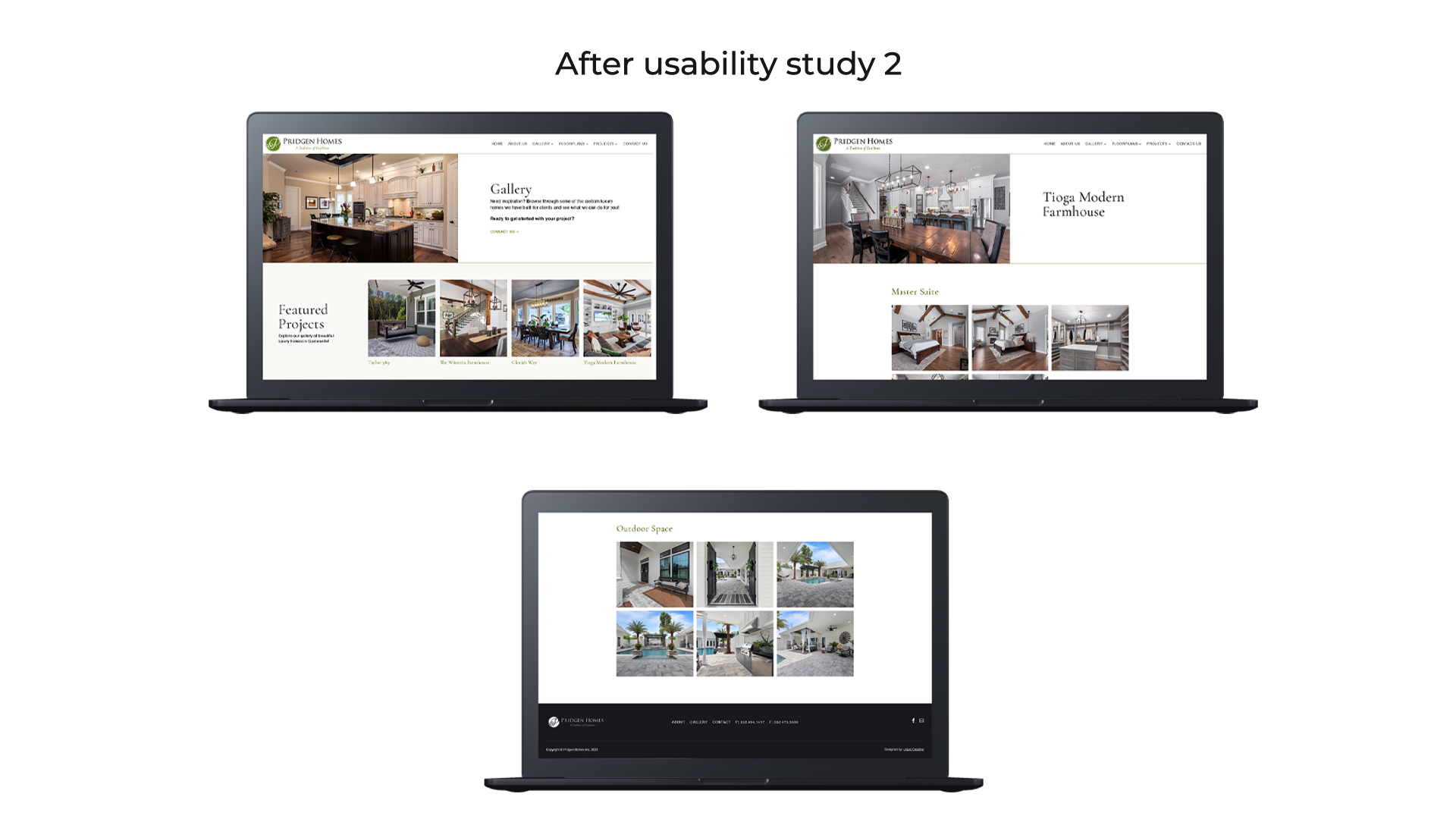
The second usability study revealed the frustration with the navigation. I ensured the user gets to access the main navigation both from the header and footer of each pages by adding the main navigation to the footer along with direct contact information.
High-fidelity Mockups
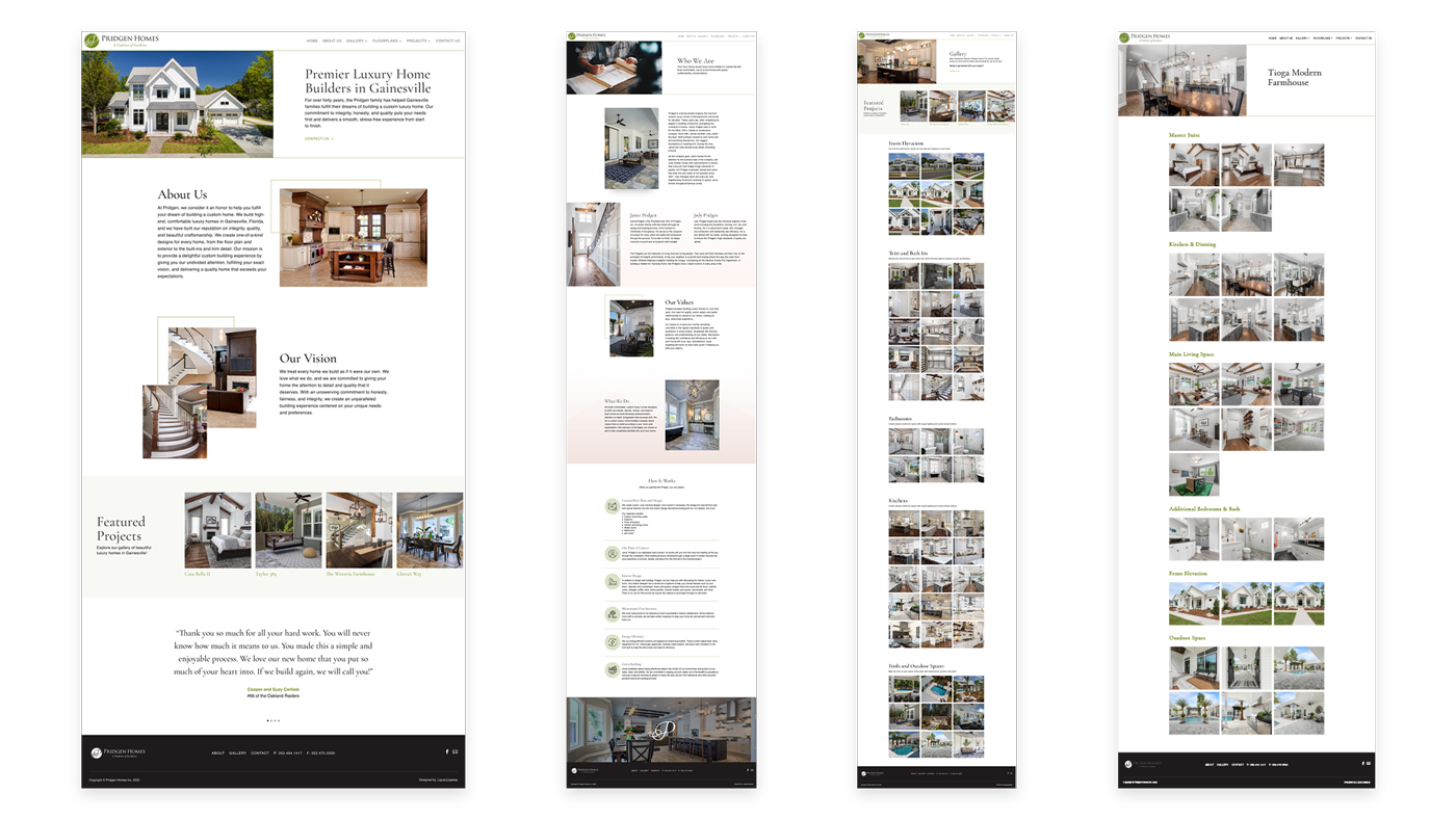
The final high-fidelity mockups and prototype presented seamless user flows throughout the website. It also met the users needs for easy navigation, simple flows, and minimal explicit layouts.
You can access the live website here
Get In Touch
For questions, project inquiries, collaborations, and more information, please feel free to send me a direct email
Say Hi
postrabiyajaffar@gmail.com
